Komorebi
Komorebi
Komorebi
A photographic event and exhibition for the the creative community of Kyoto.
A photographic event and exhibition for the the creative community of Kyoto.
Date
June 2025
What I made
Brand identity
3D exhibiton prototype
Class
Experience Design Principles
Background
Komorebi is an experiential event located in Kyoto intended to provide community for photographers. While studying abroad in Kyoto and taking a photography course, I became really interested in perspective and how differently people understand the same place. For this project, I created a complete identity and foundation for a guided photo walk and sculptural exhibit that allows participants to move through the same environment while documenting their own individual ways of seeing.
Background
Komorebi is an experiential event located in Kyoto intended to provide community for photographers. While studying abroad in Kyoto and taking a photography course, I became really interested in perspective and how differently people understand the same place. For this project, I created a complete identity and foundation for a guided photo walk and sculptural exhibit that allows participants to move through the same environment while documenting their own individual ways of seeing.
Komorebi is an experiential event located in Kyoto intended to provide community for photographers. While studying abroad in Kyoto and taking a photography course, I became really interested in perspective and how differently people understand the same place. For this project, I created a complete identity and foundation for a guided photo walk and sculptural exhibit that allows participants to move through the same environment while documenting their own individual ways of seeing.
Brand
In terms of brand, I first started with logo. I wanted Komorebi’s identity to feel calming and simple but also visually layered. The final logo I settled on combines the organic shapes of Japanese Zen gardens with the geometry of Shoji doors.

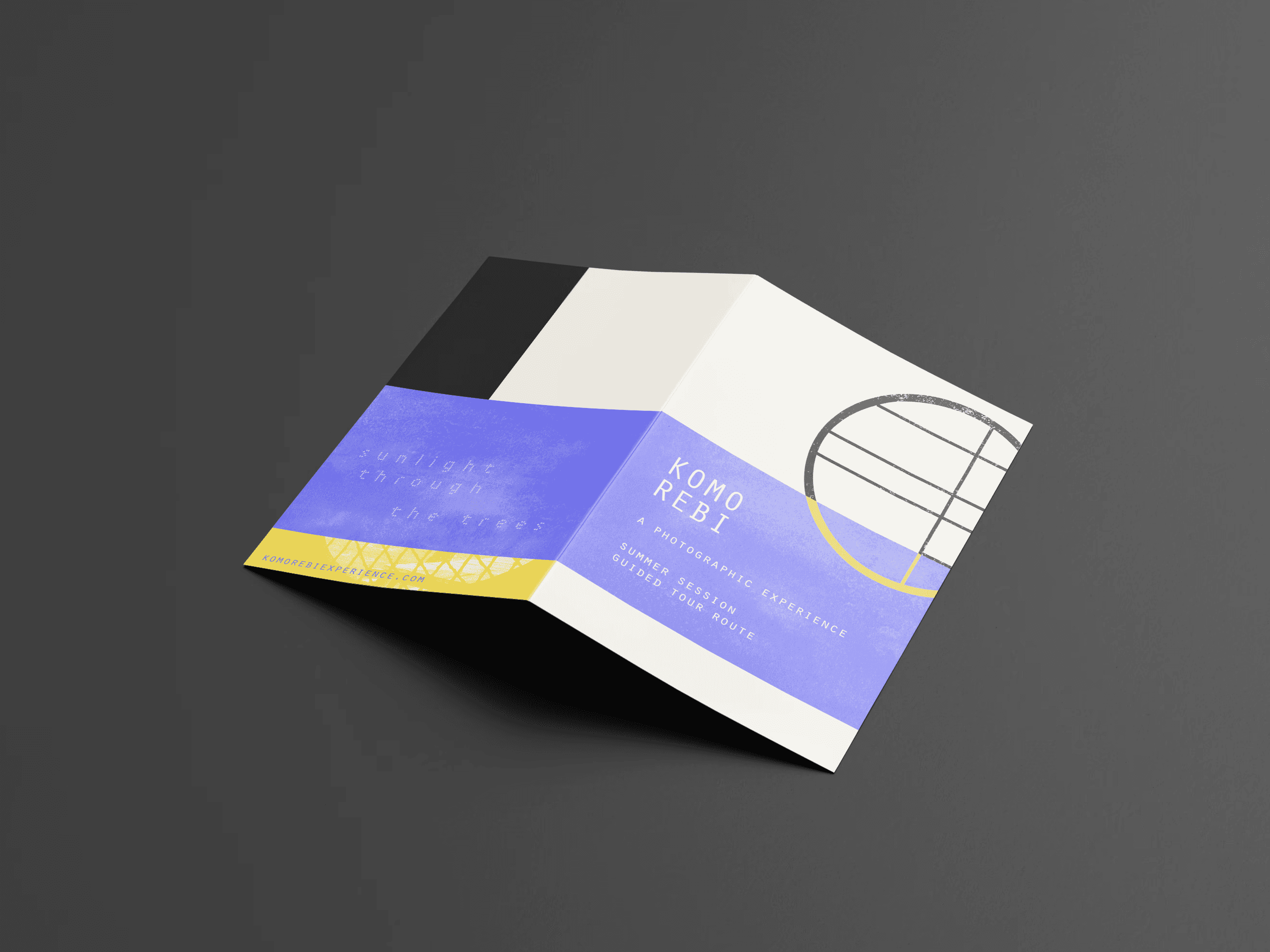
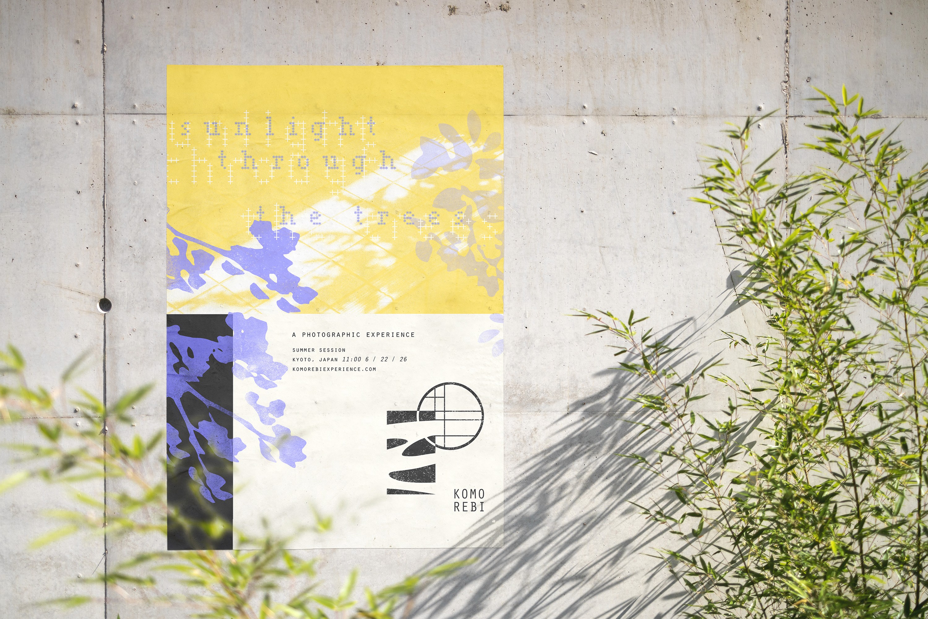
For print materials I created a promotional poster and handheld map for participants to use while they walk the event route. The event itself is located in my favorite area of Kyoto.
Brand
In terms of brand, I first started with logo. I wanted Komorebi’s identity to feel calming and simple but also visually layered. The final logo I settled on combines the organic shapes of Japanese Zen gardens with the geometry of Shoji doors.
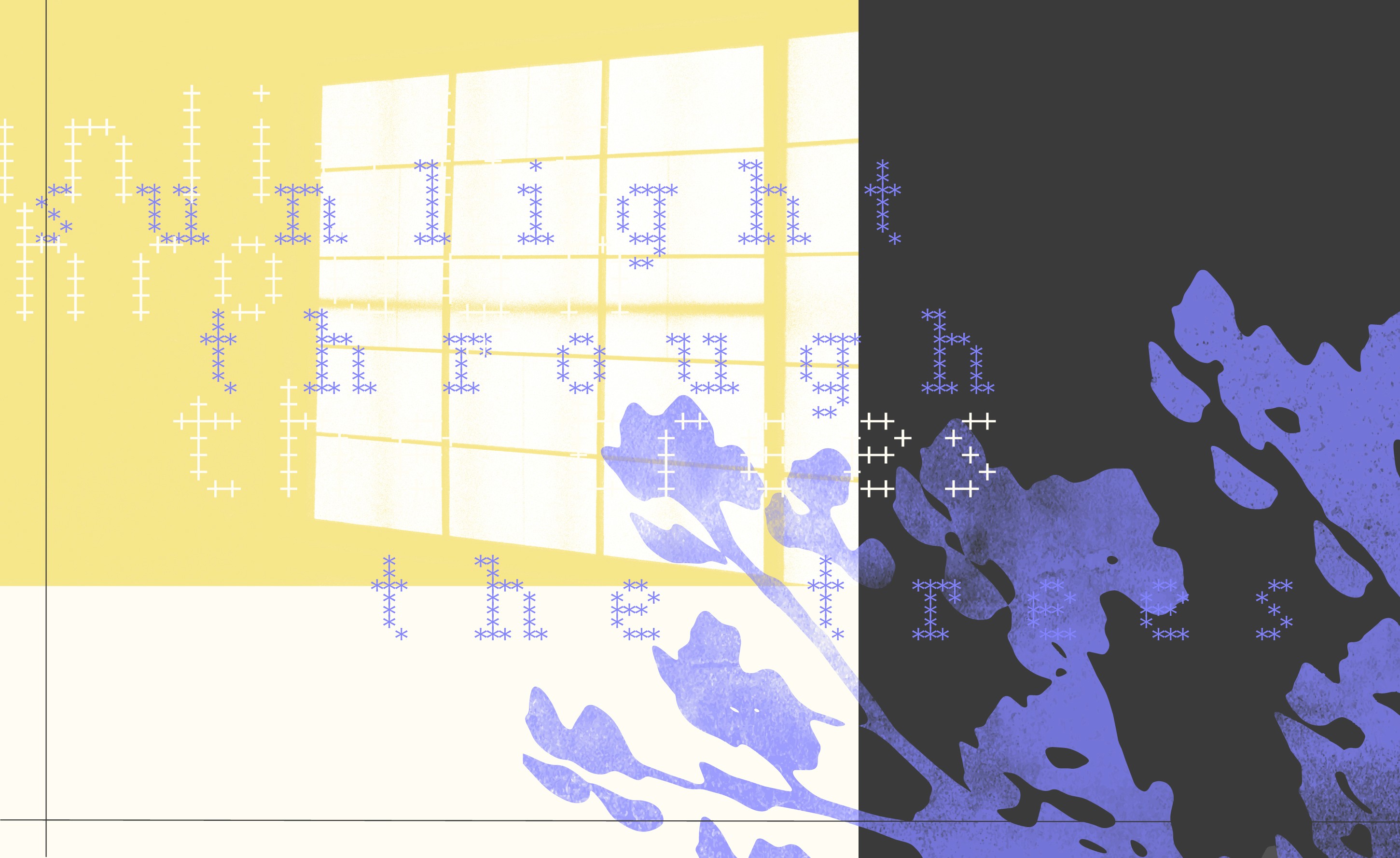
The word “Komorebi” communicates the Japanese philosophy of slowing down to notice the beauty around you. It directly translates to “sunlight through the trees” which is a phrase I also included in promotional materials.
For print materials I created a promotional poster and handheld map for participants to use while they walk the event route. The event itself is located in my favorite area of Kyoto.
Exhibit
The final exhibit would be made of wooden beams and slightly-transparent cloth. Below is the final render of the exhibit shape as well as a mockup of the material functionality. I Worked with a few different forms and eventually settled on the final shape and material through user testing.

The word “Komorebi” communicates the Japanese philosophy of slowing down to notice the beauty around you. It directly translates to “sunlight through the trees” which is a phrase I also included in promotional materials.
For print materials I created a promotional poster and handheld map for participants to use while they walk the event route. The event itself is located in my favorite area of Kyoto.


Exhibit
The final exhibit would be made of wooden beams and slightly-transparent cloth. Below is the final render of the exhibit shape as well as a mockup of the material functionality. I Worked with a few different forms and eventually settled on the final shape and material through user testing.


Pitch Presentation
A more in-depth outline of the experience and its background.
Exhibit
The final exhibit would be made of wooden beams and slightly-transparent cloth. Below is the final render of the exhibit shape as well as a mockup of the material functionality. I Worked with a few different forms and eventually settled on the final shape and material through user testing.
Pitch Presentation
A more in-depth outline of the experience and its background.
Pitch Presentation
A more in-depth outline of the experience and its background.









©
2026 ruby harkness
©