Historic Sanctuary of Machu Picchu
Historic Sanctuary of Machu Picchu
Historic Sanctuary of Machu Picchu
Brand Identity for UNESCO World Heritage Site.
Brand Identity for UNESCO World Heritage Site.
Date
Jan-April 2026
What I made
Brand Identity Design
Course
Graphic Design Synthesis
Background
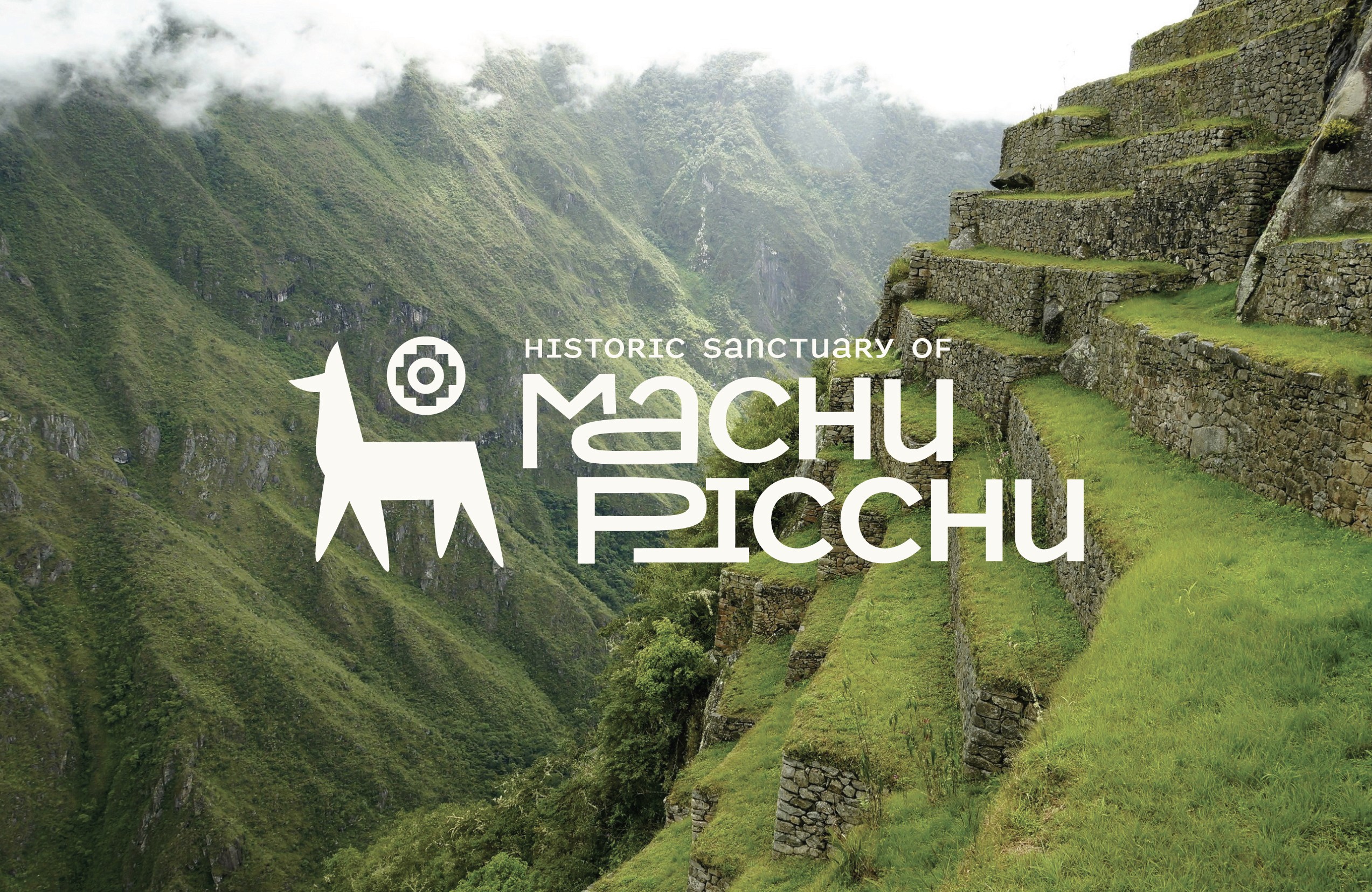
The Historic Sanctuary of Machu Picchu is a UNESCO World Heritage Site located in the Andes Mountains of Peru. It is known for its deep historical significance and is one of the most recognized cultural landmarks of the world. For this project, I designed a brand identity for the site to promote the it to visitors and emphasize its cultural importance.
Background
The Historic Sanctuary of Machu Picchu is a UNESCO World Heritage Site located in the Andes Mountains of Peru. It is known for its deep historical significance and is one of the most recognized cultural landmarks of the world. For this project, I designed a brand identity for the site to promote the it to visitors and emphasize its cultural importance.
The Historic Sanctuary of Machu Picchu is a UNESCO World Heritage Site located in the Andes Mountains of Peru. It is known for its deep historical significance and is one of the most recognized cultural landmarks of the world. For this project, I designed a brand identity for the site to promote the it to visitors and emphasize its cultural importance.
The Brand
Creation of the brand began with physical sketching and understanding what the site represents. I started by listing adjectives that could be used to describe the site. Using that list as a base, I developed a set of sketches for the logo mark and logo type. From there I narrowed down the options and eventually developed the final mark and type that aligned with my word list.
The final mark represents a llama, one of the most recognizable symbols of Machu Picchu, and the Chakana, an ancient Incan symbol. The mark represents both the physical aspects of the site and the ancient ideas associated with it. The logotype relies on layering and fitting together letters, just as the ancient Inca people layered and fit together the stones for structures on the site.
The Brand
Creation of the brand began with physical sketching and understanding what the site represents. I started by listing adjectives that could be used to describe the site. Using that list as a base, I developed a set of sketches for the logo mark and logo type. From there I narrowed down the options and eventually developed the final mark and type that aligned with my word list.
Other Applications
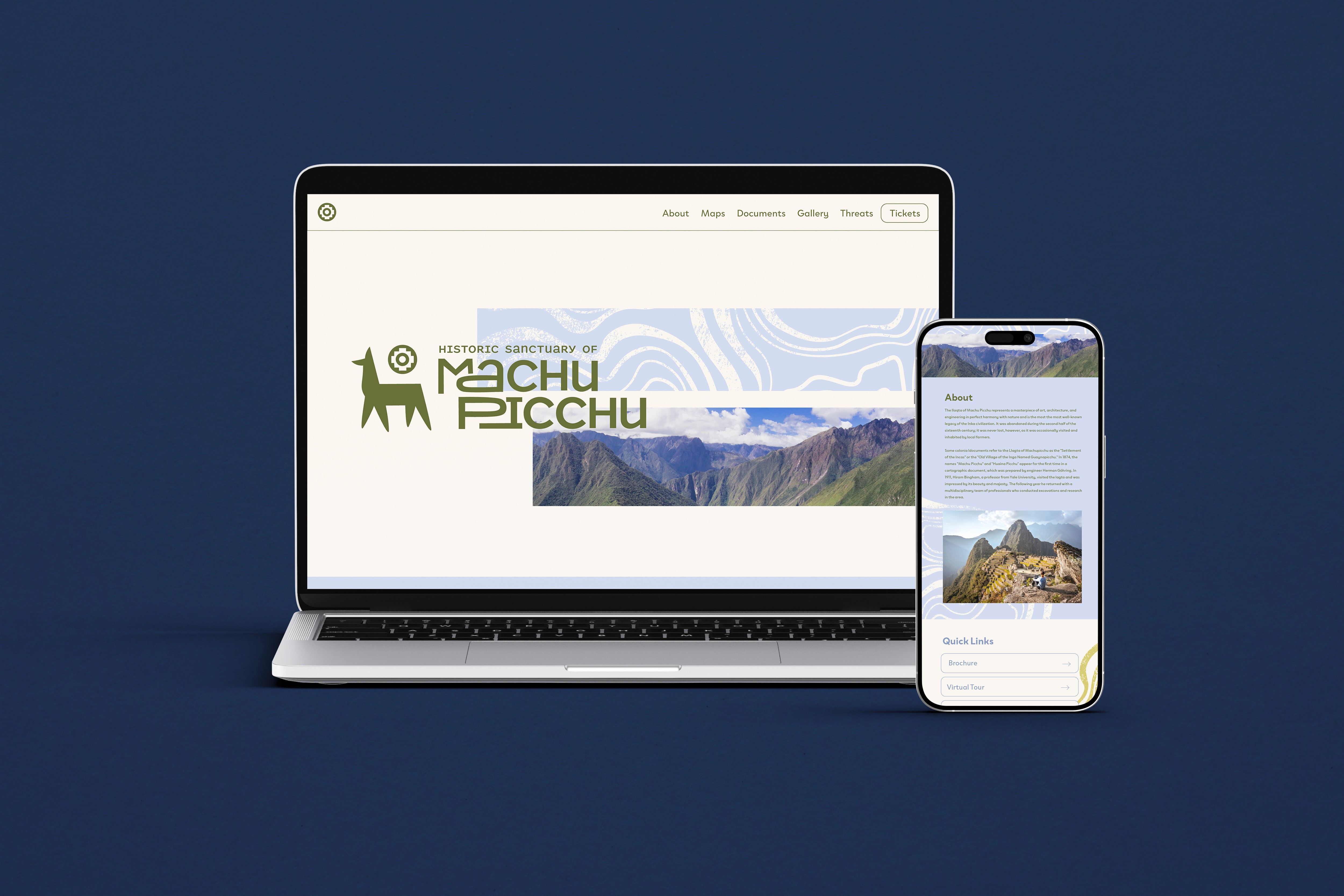
In addition to print materials, I created a website mockup, site sign, and vehicle design. The sight sign is typeset with seven different languages to accommodate visitors from various locations.
Print Media
The first applications of the identity system are a set of three event advertisements to be put in a magazine, an informational page, and a coordinated stationery set.
The Brand
Creation of the brand began with physical sketching and understanding what the site represents. I started by listing adjectives that could be used to describe the site. Using that list as a base, I developed a set of sketches for the logo mark and logo type. From there I narrowed down the options and eventually developed the final mark and type that aligned with my word list.


The final mark represents a llama, one of the most recognizable symbols of Machu Picchu, and the Chakana, an ancient Incan symbol. The mark represents both the physical aspects of the site and the ancient ideas associated with it. The logotype relies on layering and fitting together letters, just as the ancient Inca people layered and fit together the stones for structures on the site.
Print Media
The first applications of the identity system are a set of three event advertisements to be put in a magazine, an informational page, and a coordinated stationery set.


Other Applications
In addition to print materials, I created a website mockup, site sign, and vehicle design. The sight sign is typeset with seven different languages to accommodate visitors from various locations.


Print Media
The first applications of the identity system are a set of three event advertisements to be put in a magazine, an informational page, and a coordinated stationery set.
Book and Summary
The informational booklet outlines important aspects of the site and its founding, as well as gives context on the UNESCO organization and it's goals. It is divided into two sections. The final one-page-summary gives an overarching outline of the brand.
Other Applications
In addition to print materials, I created a website mockup, site sign, and vehicle design. The sight sign is typeset with seven different languages to accommodate visitors from various locations.
Book and Summary
The informational booklet outlines important aspects of the site and its founding, as well as gives context on the UNESCO organization and it's goals. It is divided into two sections. The final one-page-summary gives an overarching outline of the brand.
Book and Summary
The informational booklet outlines important aspects of the site and its founding, as well as gives context on the UNESCO organization and it's goals. It is divided into two sections. The final one-page-summary gives an overarching outline of the brand.









©
2026 ruby harkness
©