Dolomite
Dolomite
Dolomite
A brand system and website prototype for a Bay Area biotech company.
A brand system and website prototype for a Bay Area biotech company.
Date
july 2024
What I made
Brand Guidelines
Website Prototype
Company
Unchained Labs
Background
Over the summer of 2024, I worked with the Bay Area biotech company Unchained Labs to rebrand and redesign a website for a subsidiary microfluidics company called Dolomite. A complete rebrand meant we redesigned the logo, brand identity, web graphics, and web functionality. This project aimed to merge Dolomite with Unchained Labs by creating a visual identity that feels aligned with the parent brand while still remaining unique.
Background
Over the summer of 2024, I worked with the Bay Area biotech company Unchained Labs to rebrand and redesign a website for a subsidiary microfluidics company called Dolomite. A complete rebrand meant we redesigned the logo, brand identity, web graphics, and web functionality. This project aimed to merge Dolomite with Unchained Labs by creating a visual identity that feels aligned with the parent brand while still remaining unique.
Over the summer of 2024, I worked with the Bay Area biotech company Unchained Labs to rebrand and redesign a website for a subsidiary microfluidics company called Dolomite. A complete rebrand meant we redesigned the logo, brand identity, web graphics, and web functionality. This project aimed to merge Dolomite with Unchained Labs by creating a visual identity that feels aligned with the parent brand while still remaining unique.
Brand
Brand development started with the logo. I created a logo from scratch that merges with the modern clean identity of Unchained Labs. The standout element of this logo is the “m,” which is inspired by the curved channels of microfluidic chips.
Web
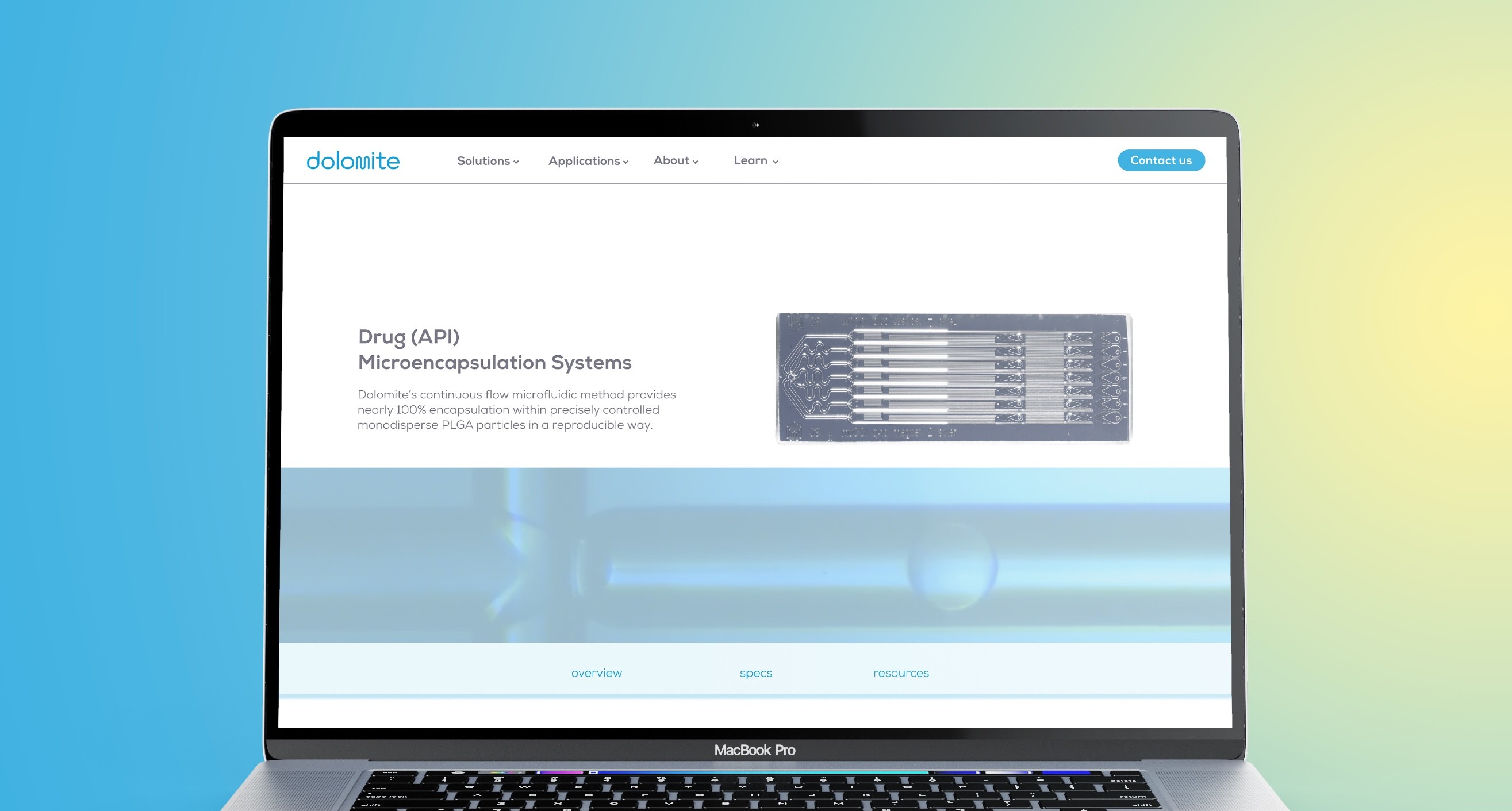
I developed 3 full pages of the site in collaboration with the marketing team. This site is intended to be reminiscent of Unchained Labs site in its functionality while implementing unique brand elements from the Dolomite redesign.
Brand
Brand development started with the logo. I created a logo from scratch that merges with the modern clean identity of Unchained Labs. The standout element of this logo is the “m,” which is inspired by the curved channels of microfluidic chips.
The color palette was one aspect of the original Dolomite brand that Unchained Labs wanted to keep due to how established it already was in the biotech space. I explored color palette more by introducing gradients as a graphic element to elevate the already recognizable brand.
Web
I developed 3 full pages of the site in collaboration with the marketing team. This site is intended to be reminiscent of Unchained Labs site in its functionality while implementing unique brand elements from the Dolomite redesign.


The color palette was one aspect of the original Dolomite brand that Unchained Labs wanted to keep due to how established it already was in the biotech space. I explored color palette more by introducing gradients as a graphic element to elevate the already recognizable brand.
Web
I developed 3 full pages of the site in collaboration with the marketing team. This site is intended to be reminiscent of Unchained Labs site in its functionality while implementing unique brand elements from the Dolomite redesign.








©
2026 ruby harkness
©